Bootstrap5.3メモ

よく使いそうなBootStrap5.3のメモ。
ドキュメント
https://getbootstrap.jp/docs/5.3/getting-started/introduction/
CDNリンク
| Description | URL |
|---|---|
| CSS | https://cdn.jsdelivr.net/npm/bootstrap@5.3.0/dist/css/bootstrap.min.css |
| JS | https://cdn.jsdelivr.net/npm/bootstrap@5.3.0/dist/js/bootstrap.bundle.min.js |
<script src="https://cdn.jsdelivr.net/npm/bootstrap@5.3.0/dist/js/bootstrap.bundle.min.js"></script>
<link rel="stylesheet" href="https://cdn.jsdelivr.net/npm/bootstrap@5.3.0/dist/css/bootstrap.min.css">
ブレイクポイント
| kpoint | Class infix | Dimensions |
|---|---|---|
| Extra small | None | <576px |
| Small | sm |
≥576px |
| Medium | md |
≥768px |
| Large | lg |
≥992px |
| Extra large | xl |
≥1200px |
| Extra extra large | xxl |
≥1400px |
https://getbootstrap.jp/docs/5.3/layout/breakpoints/
Containers
| Extra small
<576px
|
Small
≥576px
|
Medium
≥768px
|
Large
≥992px
|
X-Large
≥1200px
|
XX-Large
≥1400px
|
|
|---|---|---|---|---|---|---|
.container |
100% | 540px | 720px | 960px | 1140px | 1320px |
.container-sm |
100% | 540px | 720px | 960px | 1140px | 1320px |
.container-md |
100% | 100% | 720px | 960px | 1140px | 1320px |
.container-lg |
100% | 100% | 100% | 960px | 1140px | 1320px |
.container-xl |
100% | 100% | 100% | 100% | 1140px | 1320px |
.container-xxl |
100% | 100% | 100% | 100% | 100% | 1320px |
.container-fluid |
100% | 100% | 100% | 100% | 100% | 100% |
https://getbootstrap.jp/docs/5.3/layout/containers/
Grid system
| xs <576px |
sm ≥576px |
md ≥768px |
lg ≥992px |
xl ≥1200px |
xxl ≥1400px |
|
|---|---|---|---|---|---|---|
Container max-width |
None (auto) | 540px | 720px | 960px | 1140px | 1320px |
| Class prefix | .col- |
.col-sm- |
.col-md- |
.col-lg- |
.col-xl- |
.col-xxl- |
| # of columns | 12 | |||||
| Gutter width | 1.5rem (.75rem on left and right) | |||||
https://getbootstrap.jp/docs/5.3/layout/grid/
例
<div class="container text-center">
  <!-- Stack the columns on mobile by making one full-width and the other half-width -->
  <div class="row">
    <div class="col-md-8">.col-md-8</div>
    <div class="col-6 col-md-4">.col-6 .col-md-4</div>
  </div>

  <!-- Columns start at 50% wide on mobile and bump up to 33.3% wide on desktop -->
  <div class="row">
    <div class="col-6 col-md-4">.col-6 .col-md-4</div>
    <div class="col-6 col-md-4">.col-6 .col-md-4</div>
    <div class="col-6 col-md-4">.col-6 .col-md-4</div>
  </div>

  <!-- Columns are always 50% wide, on mobile and desktop -->
  <div class="row">
    <div class="col-6">.col-6</div>
    <div class="col-6">.col-6</div>
  </div>
</div>
マージン、パディング
https://getbootstrap.jp/docs/5.3/utilities/spacing/
m - marginを設定するクラスの場合
p - paddingを設定するクラス用
t - margin-topまたはpadding-topを設定します。
b - margin-bottomまたはpadding-bottomを設定します。
s - (start)LTRでmargin-leftまたはpadding-leftを、RTLでmargin-rightまたはpadding-rightを設定
e - (end)LTRでmargin-rightまたはpadding-right、RTLでmargin-leftまたはpadding-leftを設定
x - *-leftと*-rightの両方を設定します。
y - *-topと*-bottomの両方を設定します。
サイズ
0 - marginまたはpaddingを0に設定することで削除します。
1 - (デフォルトでは)marginまたはpaddingを$spacer * .25を設定します。
2 - (デフォルトでは)marginまたはpaddingを$spacer * .5を設定します。
3 - (デフォルトでは)marginまたはpaddingを$spacerを設定します。
4 - (デフォルトでは)marginまたはpaddingを$spacer * 1.5を設定します。
5 - (デフォルトでは)marginまたはpaddingを$spacer * 3を設定します。
auto - marginをautoに設定します。
例)
py-5
mt-3
テキスト
見出し
https://getbootstrap.jp/docs/5.3/content/typography/
見出しタグはh1~h6まで使用可能。
.h1~.h6クラスは、見た目は見出しにしたいが、hタグが使えない場合に使用。
font-size, font-weight, line-heightが適用される。
例
<p class="h1">h1. Bootstrap heading</p>
<p class="h2">h2. Bootstrap heading</p>
<p class="h3">h3. Bootstrap heading</p>
<p class="h4">h4. Bootstrap heading</p>
<p class="h5">h5. Bootstrap heading</p>
<p class="h6">h6. Bootstrap heading</p>
見出しのカスタマイズ
見出しの横に小さい文字を入れる事が出来る。
例
<h3>
  Fancy display heading
  <small class="text-body-secondary">With faded secondary text</small>
</h3>

Lead
文字を目立たせる事が出来る。
<p class="lead">
  This is a lead paragraph. It stands out from regular paragraphs.
</p>
インラインテキスト
<p>You can use the mark tag to <mark>highlight</mark> text.</p>
<p><del>This line of text is meant to be treated as deleted text.</del></p>
<p><s>This line of text is meant to be treated as no longer accurate.</s></p>
<p><ins>This line of text is meant to be treated as an addition to the document.</ins></p>
<p><u>This line of text will render as underlined.</u></p>
<p><small>This line of text is meant to be treated as fine print.</small></p>
<p><strong>This line rendered as bold text.</strong></p>
<p><em>This line rendered as italicized text.</em></p>
テキスト
https://getbootstrap.jp/docs/5.3/utilities/text/
テキストの位置調整
<p class="text-start">Start aligned text on all viewport sizes.</p>
<p class="text-center">Center aligned text on all viewport sizes.</p>
<p class="text-end">End aligned text on all viewport sizes.</p>

<p class="text-sm-start">Start aligned text on viewports sized SM (small) or wider.</p>
<p class="text-md-start">Start aligned text on viewports sized MD (medium) or wider.</p>
<p class="text-lg-start">Start aligned text on viewports sized LG (large) or wider.</p>
<p class="text-xl-start">Start aligned text on viewports sized XL (extra-large) or wider.</p>
テキストの折り返し
.text-wrap:折り返す
.text-nowrap:折り返さない
単語の区切り
.text-break:折り返す
word-wrap: break-wordとword-break: break-wordを設定することで、長い文字列がレイアウトを崩すのを防ぐ。
ブラウザのサポート範囲を広げるためoverflow-wrapの代わりに、より一般的なword-wrapを使用し、フレックスコンテナの問題を避けるために非推奨のword-break: break-wordを追加する。
フォントサイズ
<p class="fs-1">.fs-1 text</p>
<p class="fs-2">.fs-2 text</p>
<p class="fs-3">.fs-3 text</p>
<p class="fs-4">.fs-4 text</p>
<p class="fs-5">.fs-5 text</p>
<p class="fs-6">.fs-6 text</p>
fs-1~fs-6は、h1~h6のフォントサイズのみが適用される。
フォントの太さと斜体
<p class="fw-bold">Bold text.</p>
<p class="fw-normal">Normal weight text.</p>
<p class="fst-italic">Italic text.</p>
<p class="fst-normal">Text with normal font style</p>
行の高さ
<p class="lh-1">This is a long paragraph written to show how the line-height of an element is affected by our utilities. Classes are applied to the element itself or sometimes the parent element. These classes can be customized as needed with our utility API.</p>
<p class="lh-sm">This is a long paragraph written to show how the line-height of an element is affected by our utilities. Classes are applied to the element itself or sometimes the parent element. These classes can be customized as needed with our utility API.</p>
<p class="lh-base">This is a long paragraph written to show how the line-height of an element is affected by our utilities. Classes are applied to the element itself or sometimes the parent element. These classes can be customized as needed with our utility API.</p>
<p class="lh-lg">This is a long paragraph written to show how the line-height of an element is affected by our utilities. Classes are applied to the element itself or sometimes the parent element. These classes can be customized as needed with our utility API.</p>
テキストの装飾
<p class="text-decoration-underline">This text has a line underneath it.</p>
<p class="text-decoration-line-through">This text has a line going through it.</p>
<a href="#" class="text-decoration-none">This link has its text decoration removed</a>
色のリセット
テキストやリンクの色を.text-resetでリセットし、親から色を継承するようにします。
<p class="text-body-secondary">
  Muted text with a <a href="#" class="text-reset">reset link</a>.
</p>

#リンクの色に、親要素のtext-body-secondaryが適用される。
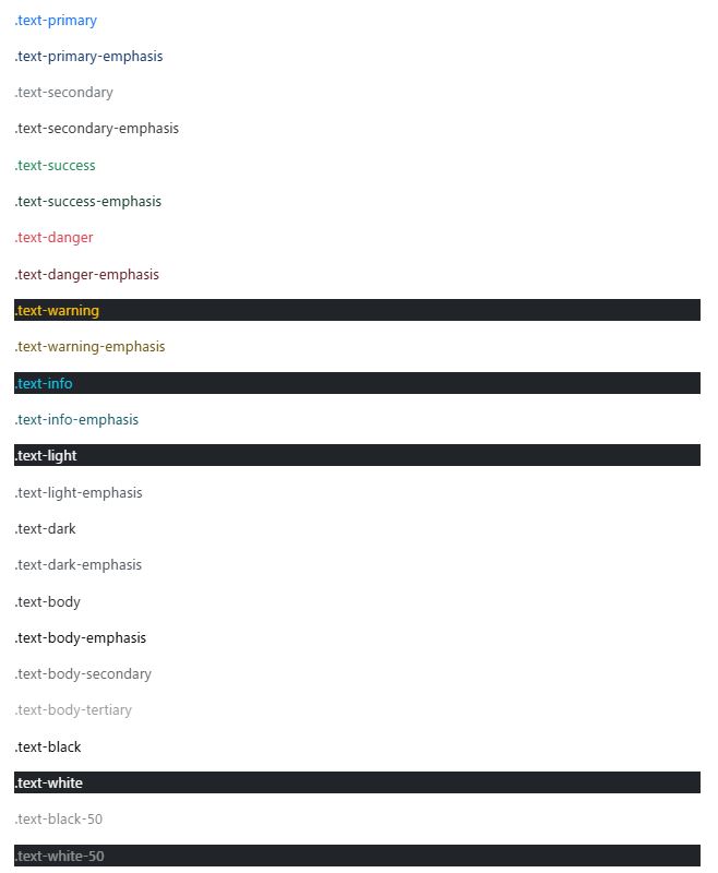
テキストカラー
<p class="text-primary">.text-primary</p>
<p class="text-primary-emphasis">.text-primary-emphasis</p>

<p class="text-secondary">.text-secondary</p>
<p class="text-secondary-emphasis">.text-secondary-emphasis</p>

<p class="text-success">.text-success</p>
<p class="text-success-emphasis">.text-success-emphasis</p>

<p class="text-danger">.text-danger</p>
<p class="text-danger-emphasis">.text-danger-emphasis</p>

<p class="text-warning bg-dark">.text-warning</p>
<p class="text-warning-emphasis">.text-warning-emphasis</p>

<p class="text-info bg-dark">.text-info</p>
<p class="text-info-emphasis">.text-info-emphasis</p>

<p class="text-light bg-dark">.text-light</p>
<p class="text-light-emphasis">.text-light-emphasis</p>

<p class="text-dark bg-white">.text-dark</p>
<p class="text-dark-emphasis">.text-dark-emphasis</p>

<p class="text-body">.text-body</p>
<p class="text-body-emphasis">.text-body-emphasis</p>
<p class="text-body-secondary">.text-body-secondary</p>
<p class="text-body-tertiary">.text-body-tertiary</p>

<p class="text-black bg-white">.text-black</p>
<p class="text-white bg-dark">.text-white</p>
<p class="text-black-50 bg-white">.text-black-50</p>
<p class="text-white-50 bg-dark">.text-white-50</p>
リンクの場合は、:hoverと:focusの状態を持つ .link-* ヘルパークラスを使うことができる。
Opacity
<div class="text-primary">This is default primary text</div>
<div class="text-primary text-opacity-75">This is 75% opacity primary text</div>
<div class="text-primary text-opacity-50">This is 50% opacity primary text</div>
<div class="text-primary text-opacity-25">This is 25% opacity primary text</div>
リンク
https://getbootstrap.jp/docs/5.3/utilities/link/
<p><a href="#" class="link-primary link-offset-2 link-underline-opacity-25 link-underline-opacity-100-hover">Primary link</a></p>
<p><a href="#" class="link-secondary link-offset-2 link-underline-opacity-25 link-underline-opacity-100-hover">Secondary link</a></p>
<p><a href="#" class="link-success link-offset-2 link-underline-opacity-25 link-underline-opacity-100-hover">Success link</a></p>
<p><a href="#" class="link-danger link-offset-2 link-underline-opacity-25 link-underline-opacity-100-hover">Danger link</a></p>
<p><a href="#" class="link-warning link-offset-2 link-underline-opacity-25 link-underline-opacity-100-hover">Warning link</a></p>
<p><a href="#" class="link-info link-offset-2 link-underline-opacity-25 link-underline-opacity-100-hover">Info link</a></p>
<p><a href="#" class="link-light link-offset-2 link-underline-opacity-25 link-underline-opacity-100-hover">Light link</a></p>
<p><a href="#" class="link-dark link-offset-2 link-underline-opacity-25 link-underline-opacity-100-hover">Dark link</a></p>
<p><a href="#" class="link-body-emphasis link-offset-2 link-underline-opacity-25 link-underline-opacity-75-hover">Emphasis link</a></p>
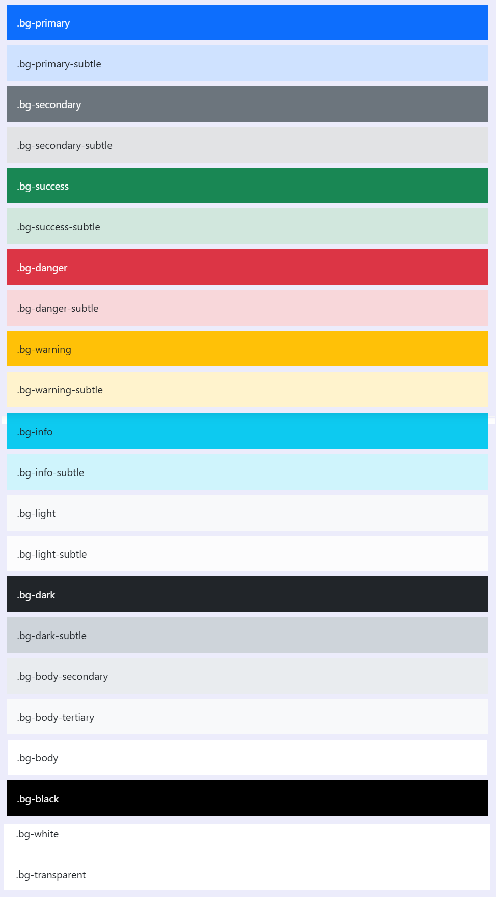
背景色
https://getbootstrap.jp/docs/5.3/utilities/background/
<div class="p-3 mb-2 bg-primary text-white">.bg-primary</div>
<div class="p-3 mb-2 bg-primary-subtle text-emphasis-primary">.bg-primary-subtle</div>

<div class="p-3 mb-2 bg-secondary text-white">.bg-secondary</div>
<div class="p-3 mb-2 bg-secondary-subtle text-emphasis-secondary">.bg-secondary-subtle</div>

<div class="p-3 mb-2 bg-success text-white">.bg-success</div>
<div class="p-3 mb-2 bg-success-subtle text-emphasis-success">.bg-success-subtle</div>

<div class="p-3 mb-2 bg-danger text-white">.bg-danger</div>
<div class="p-3 mb-2 bg-danger-subtle text-emphasis-danger">.bg-danger-subtle</div>

<div class="p-3 mb-2 bg-warning text-dark">.bg-warning</div>
<div class="p-3 mb-2 bg-warning-subtle text-emphasis-warning">.bg-warning-subtle</div>

<div class="p-3 mb-2 bg-info text-dark">.bg-info</div>
<div class="p-3 mb-2 bg-info-subtle text-emphasis-info">.bg-info-subtle</div>

<div class="p-3 mb-2 bg-light text-dark">.bg-light</div>
<div class="p-3 mb-2 bg-light-subtle text-emphasis-light">.bg-light-subtle</div>

<div class="p-3 mb-2 bg-dark text-white">.bg-dark</div>
<div class="p-3 mb-2 bg-dark-subtle text-emphasis-dark">.bg-dark-subtle</div>
<p class="p-3 mb-2 bg-body-secondary">.bg-body-secondary</p>
<p class="p-3 mb-2 bg-body-tertiary">.bg-body-tertiary</p>

<div class="p-3 mb-2 bg-body text-body">.bg-body</div>
<div class="p-3 mb-2 bg-black text-white">.bg-black</div>
<div class="p-3 mb-2 bg-white text-dark">.bg-white</div>
<div class="p-3 mb-2 bg-transparent text-body">.bg-transparent</div>
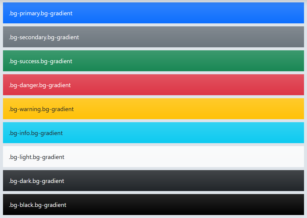
背景のグラデーション
カスタムしたい場合は、background-image:var(-bs-gradient);を利用する。
ボーダー
https://getbootstrap.jp/docs/5.3/utilities/borders/
<span class="border"></span>
<span class="border-top"></span>
<span class="border-end"></span>
<span class="border-bottom"></span>
<span class="border-start"></span>

ボーダーを消す
<span class="border border-0"></span>
<span class="border border-top-0"></span>
<span class="border border-end-0"></span>
<span class="border border-bottom-0"></span>
<span class="border border-start-0"></span>
ボーダーカラー
<span class="border border-primary"></span>
<span class="border border-primary-subtle"></span>
<span class="border border-secondary"></span>
<span class="border border-secondary-subtle"></span>
<span class="border border-success"></span>
<span class="border border-success-subtle"></span>
<span class="border border-danger"></span>
<span class="border border-danger-subtle"></span>
<span class="border border-warning"></span>
<span class="border border-warning-subtle"></span>
<span class="border border-info"></span>
<span class="border border-info-subtle"></span>
<span class="border border-light"></span>
<span class="border border-light-subtle"></span>
<span class="border border-dark"></span>
<span class="border border-dark-subtle"></span>
<span class="border border-black"></span>
<span class="border border-white"></span>

border-radius
<img src="..." class="rounded" alt="...">
<img src="..." class="rounded-top" alt="...">
<img src="..." class="rounded-end" alt="...">
<img src="..." class="rounded-bottom" alt="...">
<img src="..." class="rounded-start" alt="...">
<img src="..." class="rounded-circle" alt="...">
<img src="..." class="rounded-pill" alt="...">

サイズ
<img src="..." class="rounded-0" alt="...">
<img src="..." class="rounded-1" alt="...">
<img src="..." class="rounded-2" alt="...">
<img src="..." class="rounded-3" alt="...">
<img src="..." class="rounded-4" alt="...">
<img src="..." class="rounded-5" alt="...">
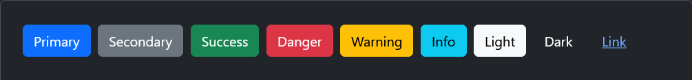
ボタン
https://getbootstrap.jp/docs/5.3/components/buttons/
<button type="button" class="btn btn-primary">Primary</button>
<button type="button" class="btn btn-secondary">Secondary</button>
<button type="button" class="btn btn-success">Success</button>
<button type="button" class="btn btn-danger">Danger</button>
<button type="button" class="btn btn-warning">Warning</button>
<button type="button" class="btn btn-info">Info</button>
<button type="button" class="btn btn-light">Light</button>
<button type="button" class="btn btn-dark">Dark</button>
<button type="button" class="btn btn-link">Link</button>
アウトラインボタン
<button type="button" class="btn btn-outline-primary">Primary</button>
<button type="button" class="btn btn-outline-secondary">Secondary</button>
<button type="button" class="btn btn-outline-success">Success</button>
<button type="button" class="btn btn-outline-danger">Danger</button>
<button type="button" class="btn btn-outline-warning">Warning</button>
<button type="button" class="btn btn-outline-info">Info</button>
<button type="button" class="btn btn-outline-light">Light</button>
<button type="button" class="btn btn-outline-dark">Dark</button>

サイズ
大きいボタン
<button type="button" class="btn btn-primary btn-lg">Large button</button>
<button type="button" class="btn btn-secondary btn-lg">Large button</button>
小さいボタン
<button type="button" class="btn btn-primary btn-sm">Small button</button>
<button type="button" class="btn btn-secondary btn-sm">Small button</button>
要素のサイズ調整
https://getbootstrap.jp/docs/5.3/utilities/sizing/
幅と高さのユーティリティは_utilities.scssから生成される。デフォルトでは25%, 50%, 75%, 100%, autoがサポートされている。
<div class="w-25 p-3">Width 25%</div>
<div class="w-50 p-3">Width 50%</div>
<div class="w-75 p-3">Width 75%</div>
<div class="w-100 p-3">Width 100%</div>
<div class="w-auto p-3">Width auto</div>

<div style="height: 100px;">
  <div class="h-25 d-inline-block" style="width: 120px;">Height 25%</div>
  <div class="h-50 d-inline-block" style="width: 120px;">Height 50%</div>
  <div class="h-75 d-inline-block" style="width: 120px;">Height 75%</div>
  <div class="h-100 d-inline-block" style="width: 120px;">Height 100%</div>
  <div class="h-auto d-inline-block" style="width: 120px;">Height auto</div>
</div>
max-widthとmax-heightの指定(100%のみ。)
mw-100
mh-100
ビューポート単位のwidthやheightを指定
<div class="min-vw-100">Min-width 100vw</div>
<div class="min-vh-100">Min-height 100vh</div>
<div class="vw-100">Width 100vw</div>
<div class="vh-100">Height 100vh</div>
要素のOpacity
https://getbootstrap.jp/docs/5.3/utilities/opacity/
<div class="opacity-100">...</div>
<div class="opacity-75">...</div>
<div class="opacity-50">...</div>
<div class="opacity-25">...</div>
テーブル
https://getbootstrap.jp/docs/5.3/content/tables/
基本
<table class="table">
  <thead>
    <tr>
      <th>#</th>
      <th>First</th>
      <th>Last</th>
      <th>Handle</th>
    </tr>
  </thead>
  <tbody>
    <tr>
      <th>1</th>
      <td>Mark</td>
      <td>Otto</td>
      <td>@mdo</td>
    </tr>
    <tr>
      <th>2</th>
      <td>Jacob</td>
      <td>Thornton</td>
      <td>@fat</td>
    </tr>
    <tr>
      <th>3</th>
      <td colspan="2">Larry the Bird</td>
      <td>@twitter</td>
    </tr>
  </tbody>
</table>
ストライプ
<table class="table table-striped">
  ...
</table>
ボーダー有りテーブル
<table class="table table-bordered">
  ...
</table>
小型テーブル
paddingが半分になる。
<table class="table table-sm">
  ...
</table>
垂直方向の位置
table や td に適用できる
.align-top
.align-middle
.align-bottom
テーブル上部
<thead>に背景色を付ける
<table class="table">
  <thead class="table-light">
    ...
  </thead>
  <tbody>
    ...
  </tbody>
</table>
レスポンシブ
レスポンシブと言ってもBootstrapのテーブルは横スクロールするだけ。
<div class="table-responsive">
  <table class="table">
    ...
  </table>
</div>
Forms
https://getbootstrap.jp/docs/5.3/forms/overview/